Power Hour Mania is an ongoing game-development passion project being worked on by a team of 15 people in their free time.
All assets are being created in-house, and the game has an estimated release date of late 2025. The comedy duo, Game Grumps, serve as the inspiration.
All typography in the logo is hand-generated.
Power Hour Mania takes many creative cues from Nintendo's Paper Mario franchise, but with a synthwave influence to the aesthetic.
A trailer featuring in-game footage of the proof-of-concept demo can be viewed at the bottom of the page.
Colors were labeled and arranged in rainbow order for colorblind team members.
Character Design
All NPCs in the game take inspiration from fan-favorite or otherwise notorious jokes made throughout Game Grumps' history.
This character is based on Elvis Presley, except he yells any time he speaks.
His name is Yellvis.
A quick anatomy and Elvis study using promotional photos for Jailhouse Rock served as an animation keyframe brainstorm.
A play on the red-haired fast food mascot, Mendy is a healer NPC native to the cyber world. Mendy is the first character Katie designed for the project, and in 2024 she revisited the design.
2021 design
Overly complex shapes and unnecessary detail make the original design difficult to read and difficult to animate.
2024 redesign
The simplified design keeps the essence of the original, and also clarifies the underlying concept of an electrically-based life form.
Idle animations for high-health, mid-health, and low-health
Monitron is a violently lovesick robot and the act 2 mini-boss.
As the battle goes on, her demeanor transitions from rage to despair as she begins to realize her love is not meant to be.
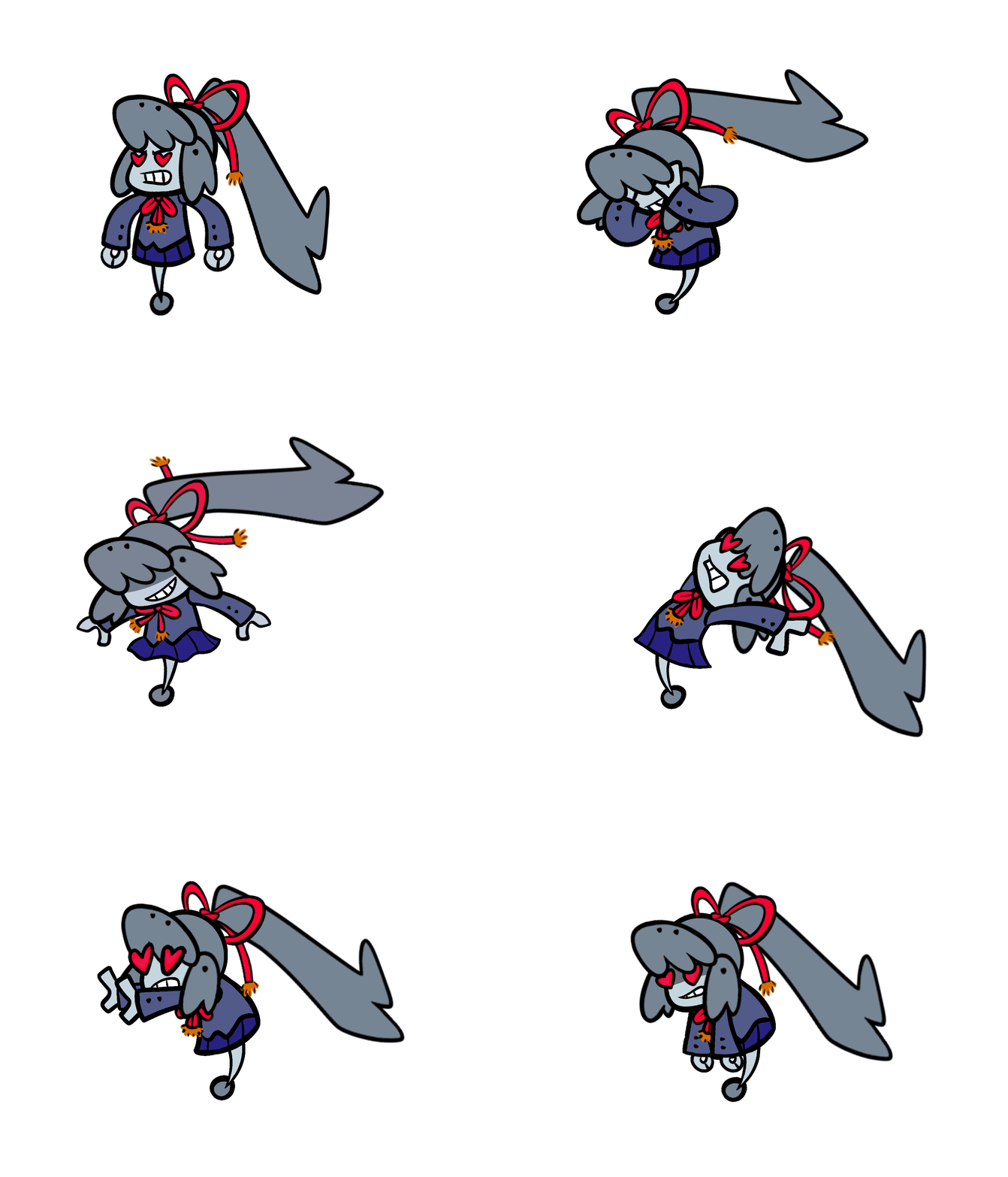
Heartwave 1
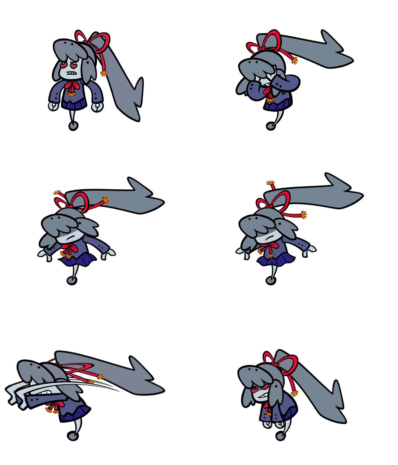
Heartwave 2
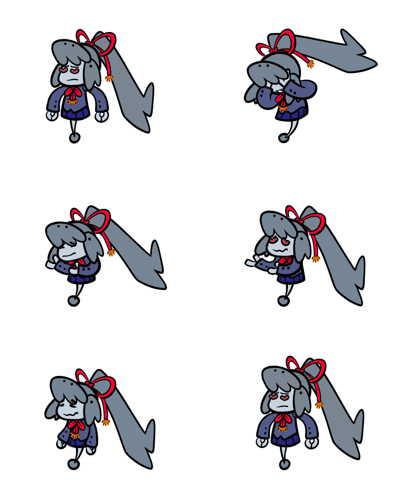
Heartwave 3

Thunderous Jealousy
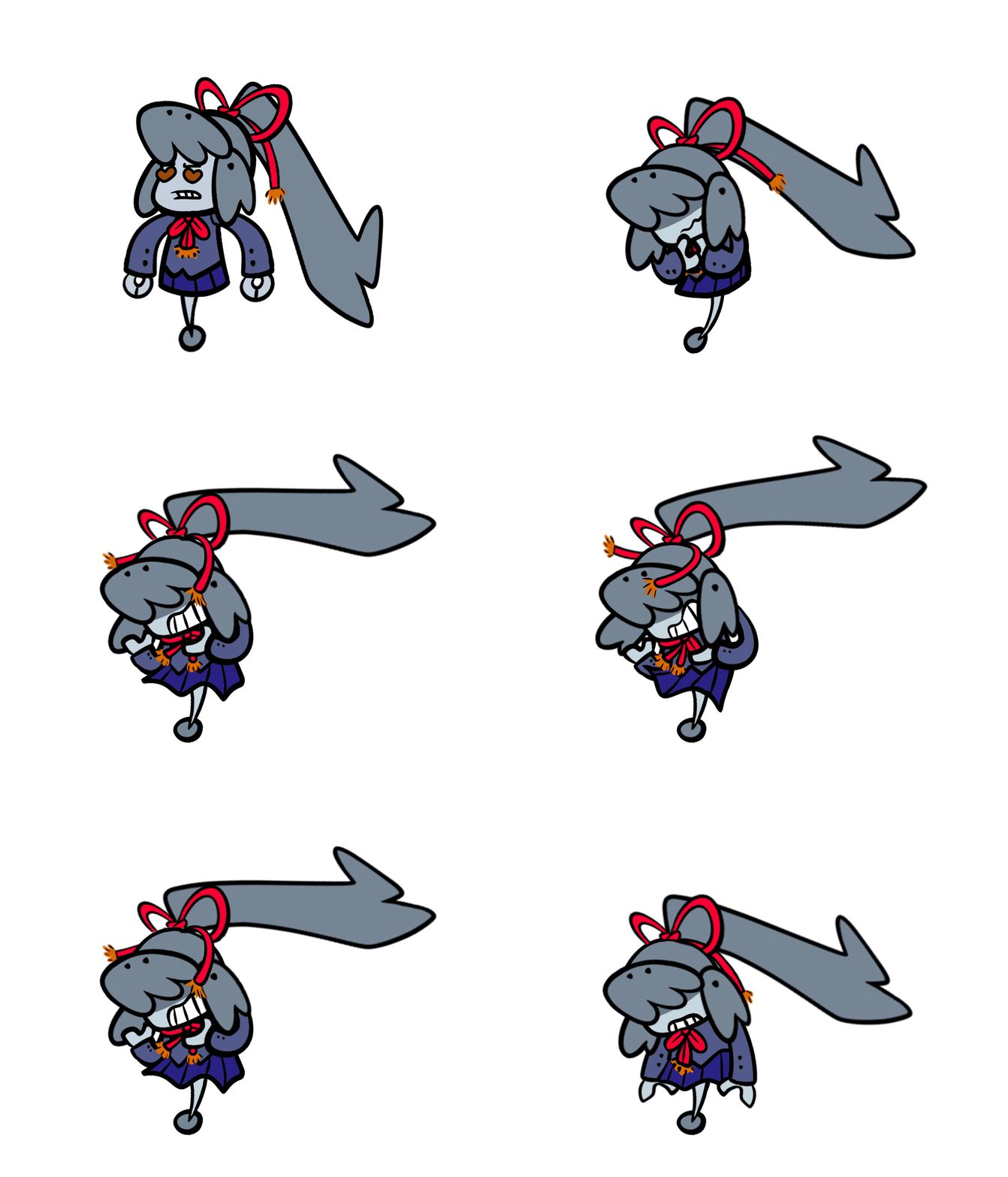
Chilling Envy
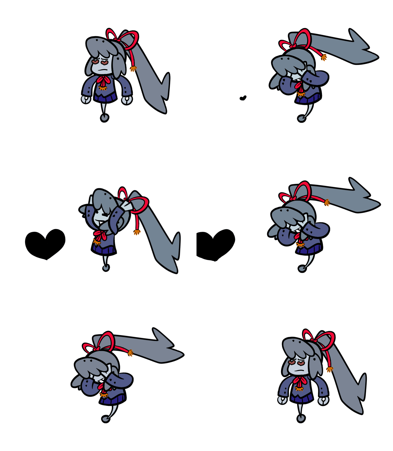
Spiteful Loneliness (black heart is FPO)
Attack animation concepts were created in collaboration with the creative director, who handles all battle design.
Monitron's throwing animation
Maps and Concept Art
Currently (as of 12/19/24), the game's locations are still being modeled and set dressed. For that reason, this section will focus on displaying concept art.
Green geography indicates an intact simulation; purple geography indicates simulation decay.
The game takes place within a simulated cyberspace island that slowly deteriorates over time from a spreading glitchiness.
Labelled version of the map
The map helps to visualize what landmarks should be visible from which areas.
Topographical version of the map
Trees act as visual barriers, and the topography helps to emphasize or de-emphasize landmarks seen in the distance.
Wide, shallow areas are optimal for set dressing with a strafing camera.
“I love the callout for what's visible, this is some kickass detail.”
– Kyoshi (programmer)
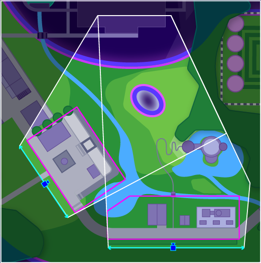
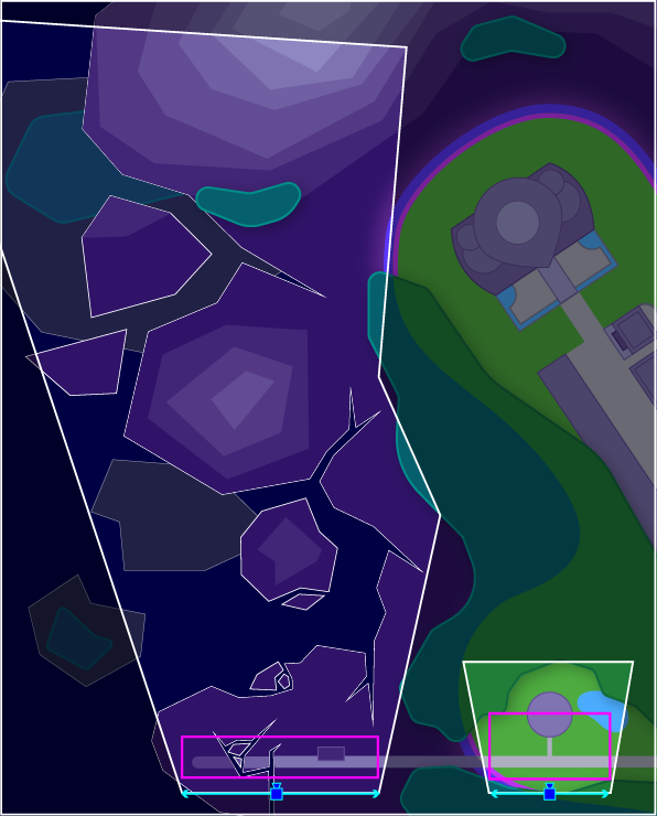
The above diagrams show how the camera angles interact with the placement of landmarks to create purposefully composed backgrounds.
From the pink sun to the suspiciously named "Human Club," even the intact portions of the simulation are not quite convincing—this is because it was programmed by aliens unfamiliar with the earthling experience.
Early simulation decay concept art created by Inkarat
The castle will be seen at a distance, so its silhouette was prioritized over other types of details.
Colors are labeled for colorblind team members. The labels are beneficial for those with full trichromatic color vision as well.
Pre-destruction
Mid-reconstruction
In an optional side quest, the player will collect gingerbread pieces throughout the world to assist a distraught NPC in rebuilding their life-sized gingerbread house after it is destroyed by the act 1 boss.
“I love this idea, [it brings] the town to life a bit more.”
- Lithamus (2D/3D artist)
Because the gingerbread house will be a modular, dynamic asset, a concept board of inspiration images was also provided for easier iteration.
From "Building the TALLEST Gingerbread House! - Ten Minute Power Hour."
Minimizing visual obstruction was prioritized to improve player visibility.
The first concept art Katie created was the town’s library. After gaining the skills to recognize what was lacking in the original, Katie revamped the concept in 2024.
Formal English landscaping served as the aesthetic baseline. A map was then created that planned out all necessary functions of the area.
A chess motif replaced the vague Monopoly motif of the original.
Want to see in-game footage?
You can watch the game trailer on our YouTube channel that we released in August 2024. You can also visit the Studio StegoRaptor website.
"This looks incredible! I love the Paper Mario aesthetic going on with the game so far. Keep at it guys!"
"The amount and variety of detail and care put into this game is amazingg!!"
"This looks great. Keep up the good work and don't rush it, I'll be waiting."
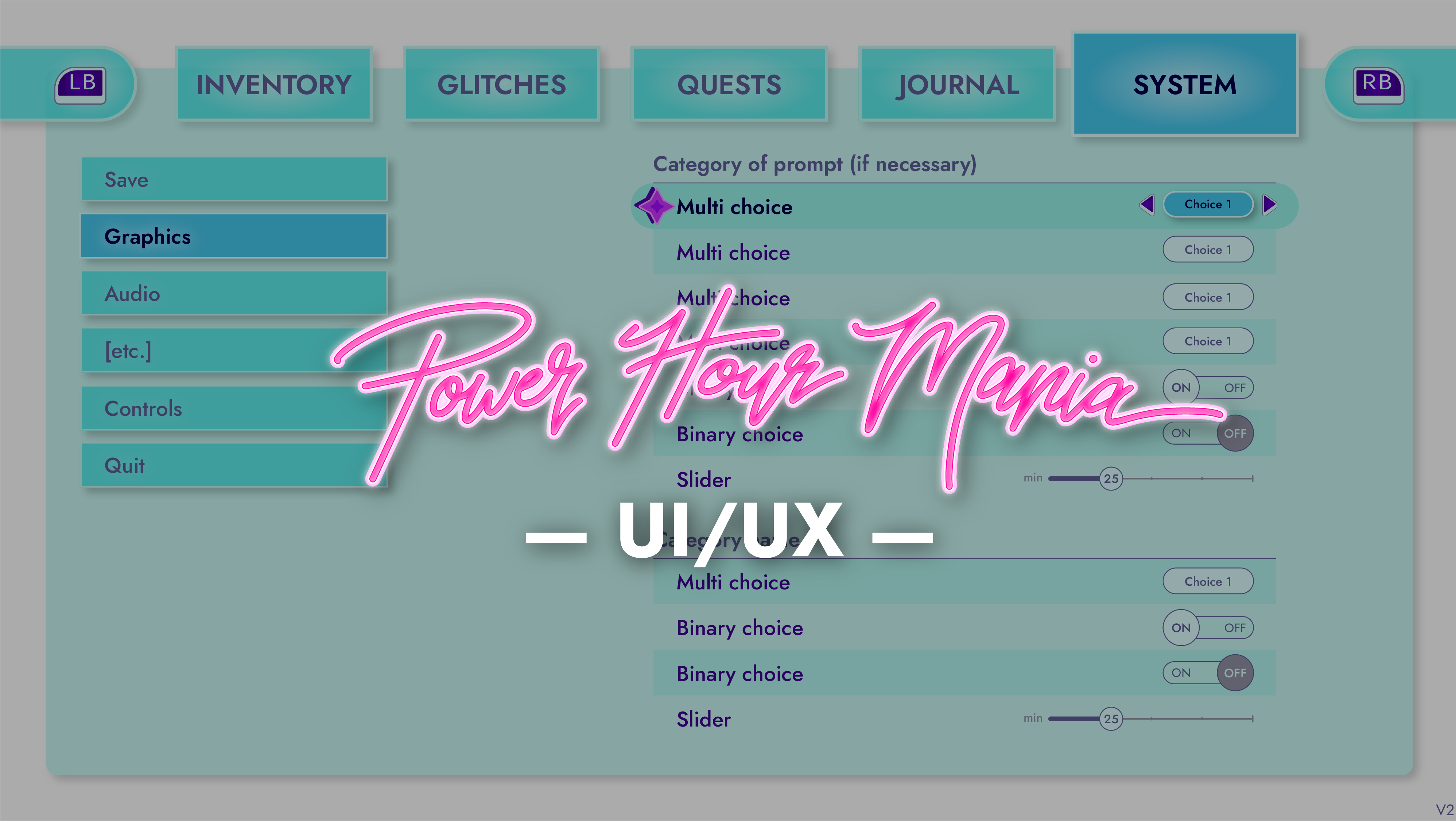
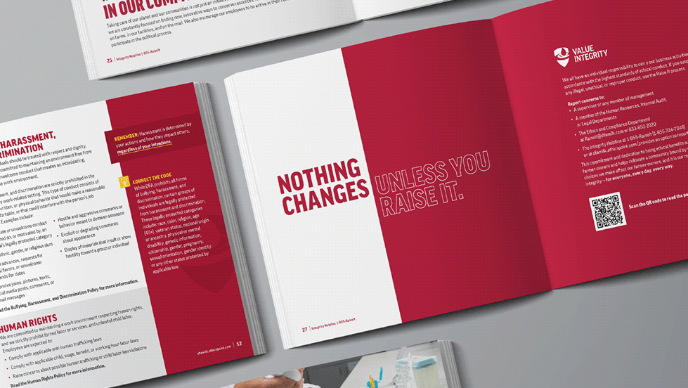
In addition to her role as the art director and as an artist, Katie is also the UI/UX designer. Take a look at the rest of her work on this project below!
Contributors
Valler | Creative director
Kyoshi | Lead programmer
Alex | Programmer
BigBlueBackpack | Lead writer
Adonic | Writer, marketing specialist
RazberryRaccoon | Social media manager
Pieter van Vleuten | Lead musician
Terra Nocturnus | Musician
Sam LaGrego | Musician
Katie | 2D art director/artist, UI/UX
Lithamus | 2D and 3D artist
Aeryn Christie | 2D artist
Inkarat | 2D artist (former)
Sebnimations | 3D art director/artist
Ghan | 3D artist
Denis "Juba" Marcelino | 3D artist

