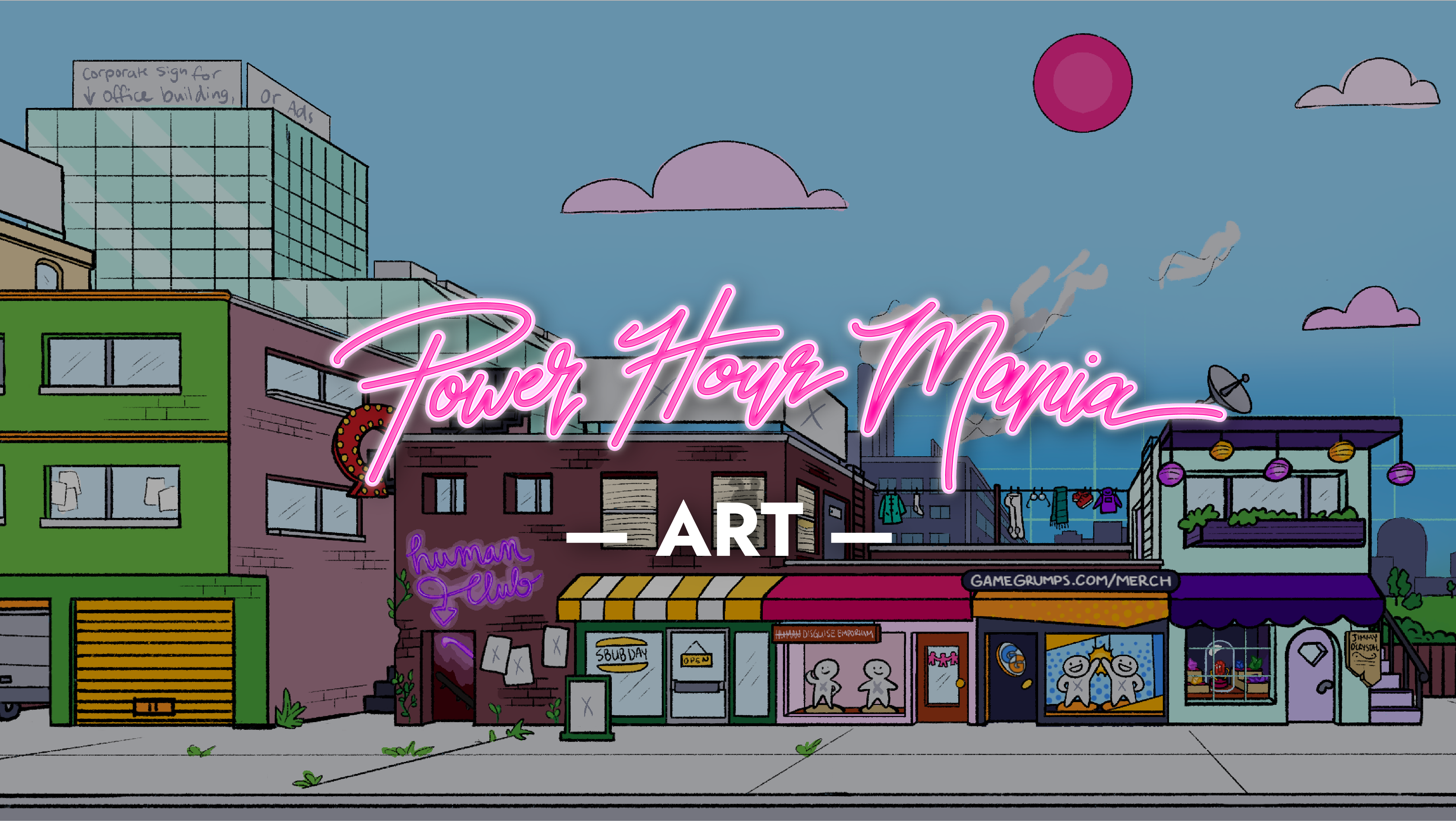
Power Hour Mania is an ongoing game-development passion project being worked on by a team of 15 people in their free time.
All assets are being created in-house, and the game has an estimated release date of late 2025. The comedy duo, Game Grumps, serve as the inspiration.
Background art, neon sign illustration by Aeryn Christie | Arin (right) sprite by Lithamus | Dan (left) sprite, hamburger sprite, enemy sprites by Inkarat
Currently (as of 12/19/24), the game's user interfaces are still being programmed in-engine. For that reason, this page will focus on displaying the completed set of high fidelity wireframes.
A trailer featuring in-game footage of the proof-of-concept demo can be viewed at the bottom of the page.
A neon sign on the set of the show, which depicts Dan (left) and Arin (right), will function as the battle UI’s centerpiece.
Colors were later changed to blue and pink for consistency—blue UI elements typically refer to Dan, and pink to Arin.
The final sign will be 3D modeled, and its neon lighting will flicker in response to Hit Point (HP) and Friend Point (FP) values.
Numeric fractions for HP and FP are included for clarity, and up to 3 status effects can be displayed on each side of the module.
"I love these mockups, they're so clear."
– Kyoshi (programmer)
Background art by Inkarat
The UI reflects gameplay concepts, using drop shadows and reduced panel opacity to recall a holographic interface.
By creating a system of standardized specs, updating the code as the visual language developed was as simple as adjusting style sheet classes.
A standardized grid is used across all interfaces.
Additional measurements are given when greater specificity is needed.

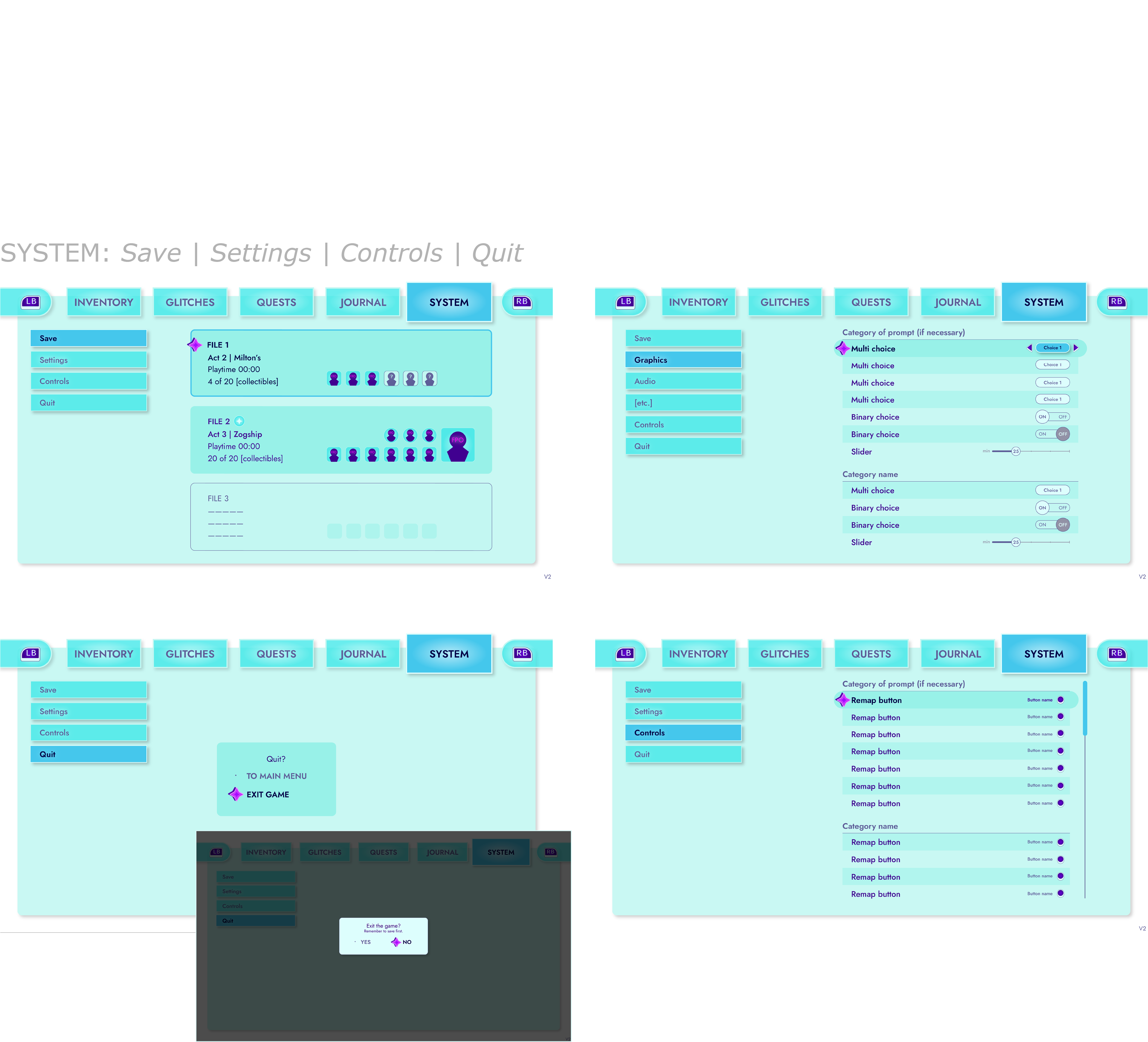
High fidelity main menu UI map
Buttons, panels, and other UI elements come together to form larger modules seen throughout the interface system.
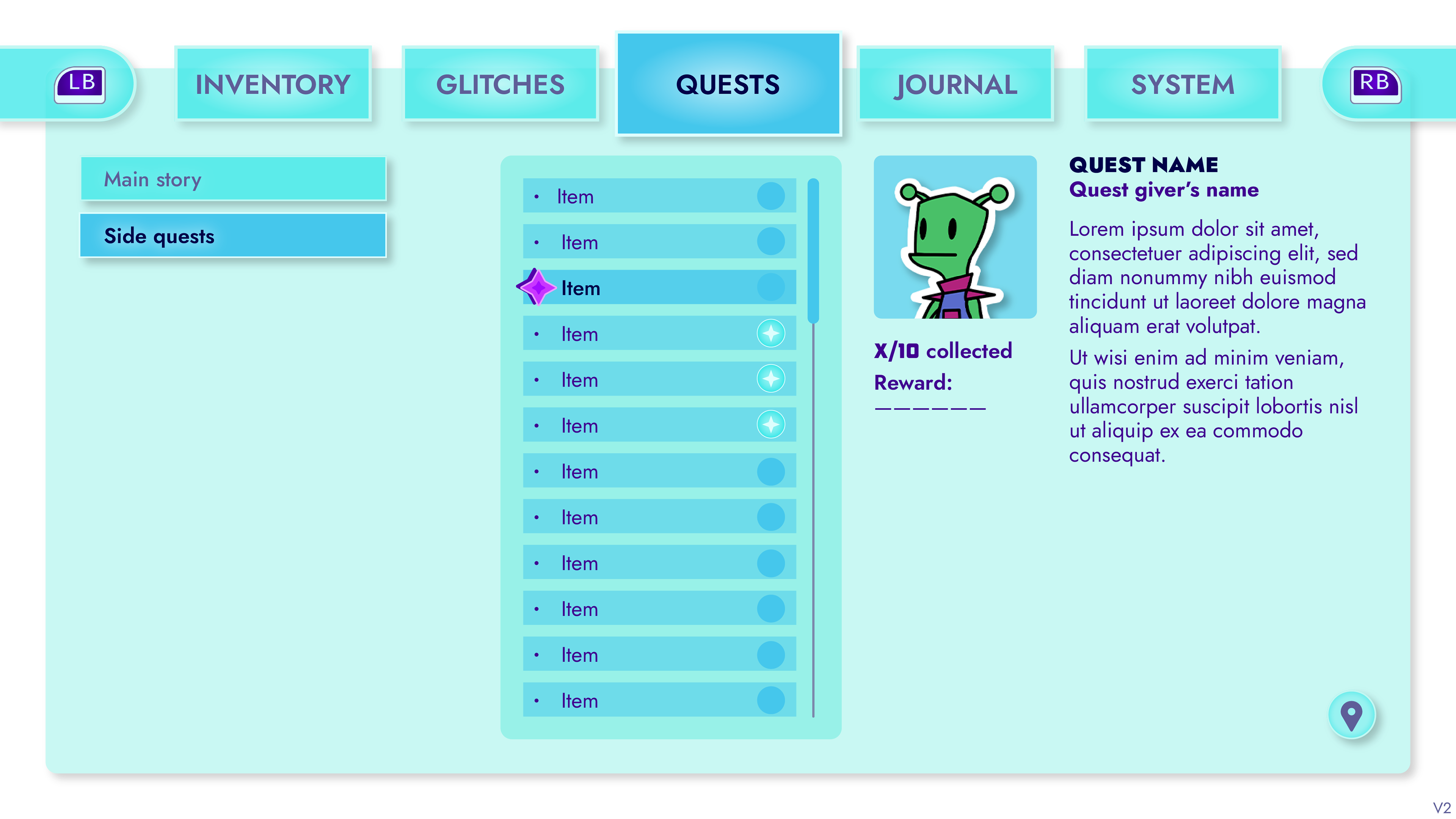
Spec standardization reduces the amount of work programmers must do.

It also simplifies the design process for the designer, because fewer unique choices need to be made.
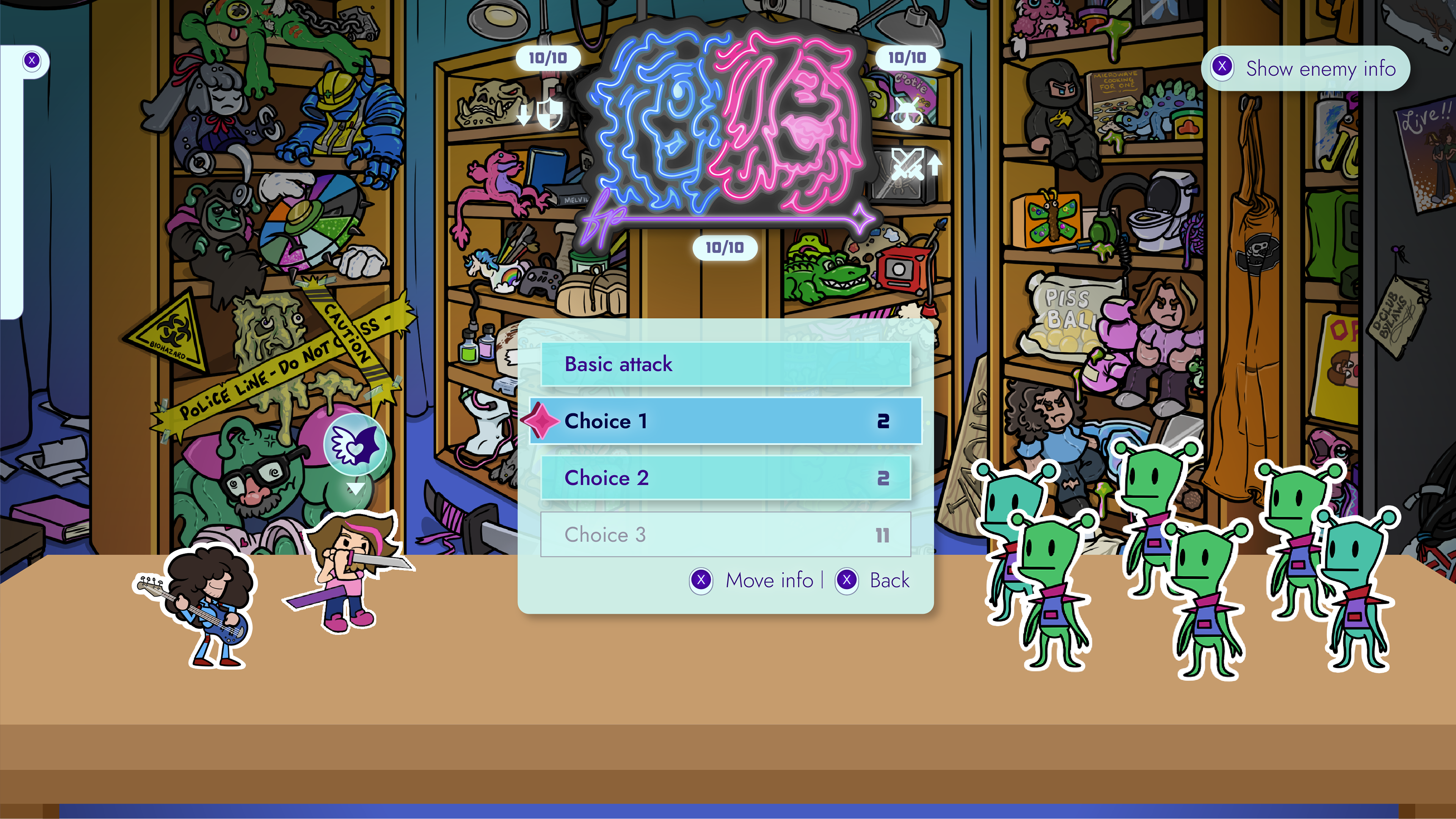
Certain modules will have unique elements appended to them, such as the number of FP an action requires (number on the button's far right).

Wherever possible, elements were spaced in increments of 15.
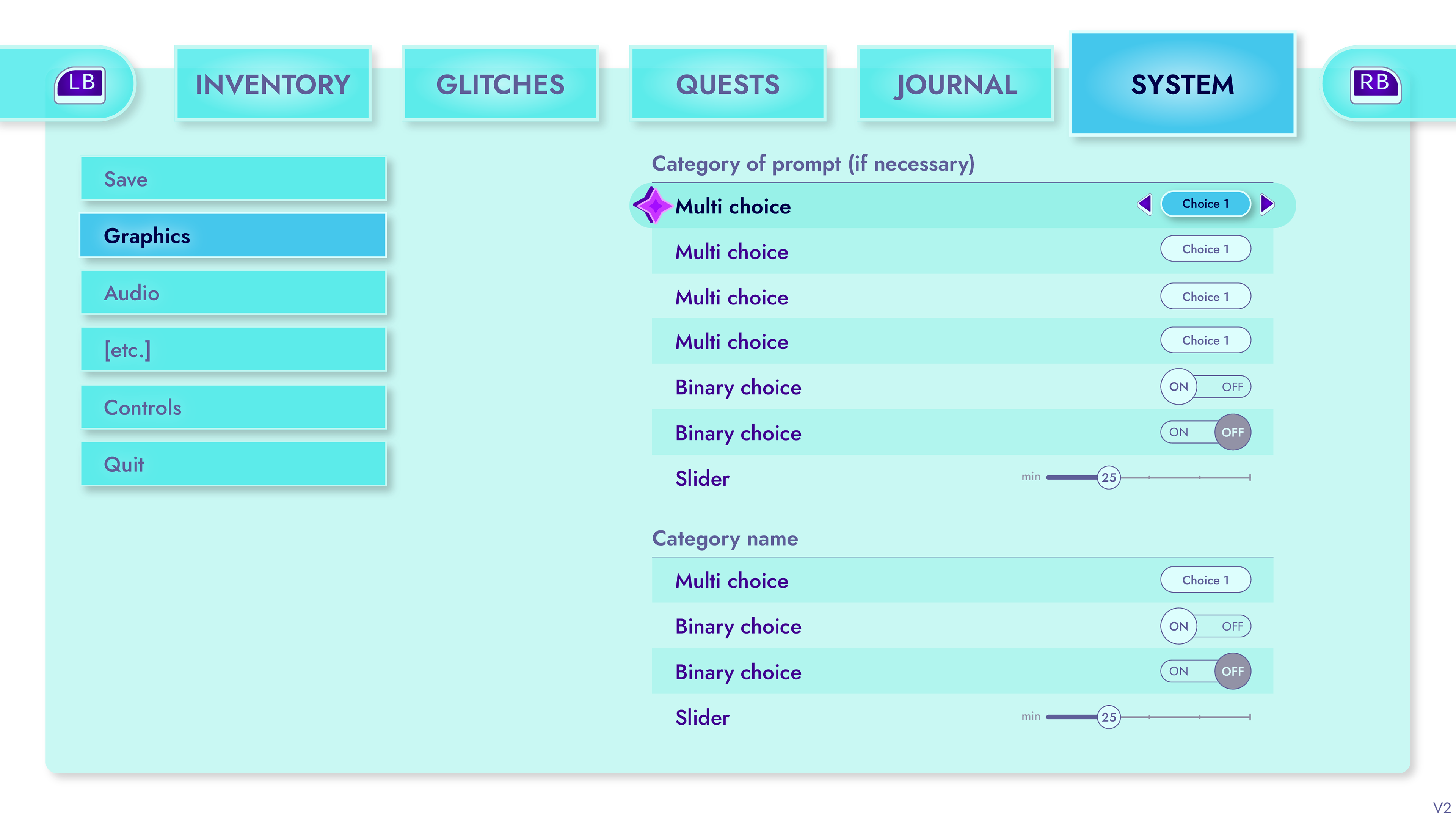
The more consistent and predictable a UI's visual language is, the greater the user experience will be.
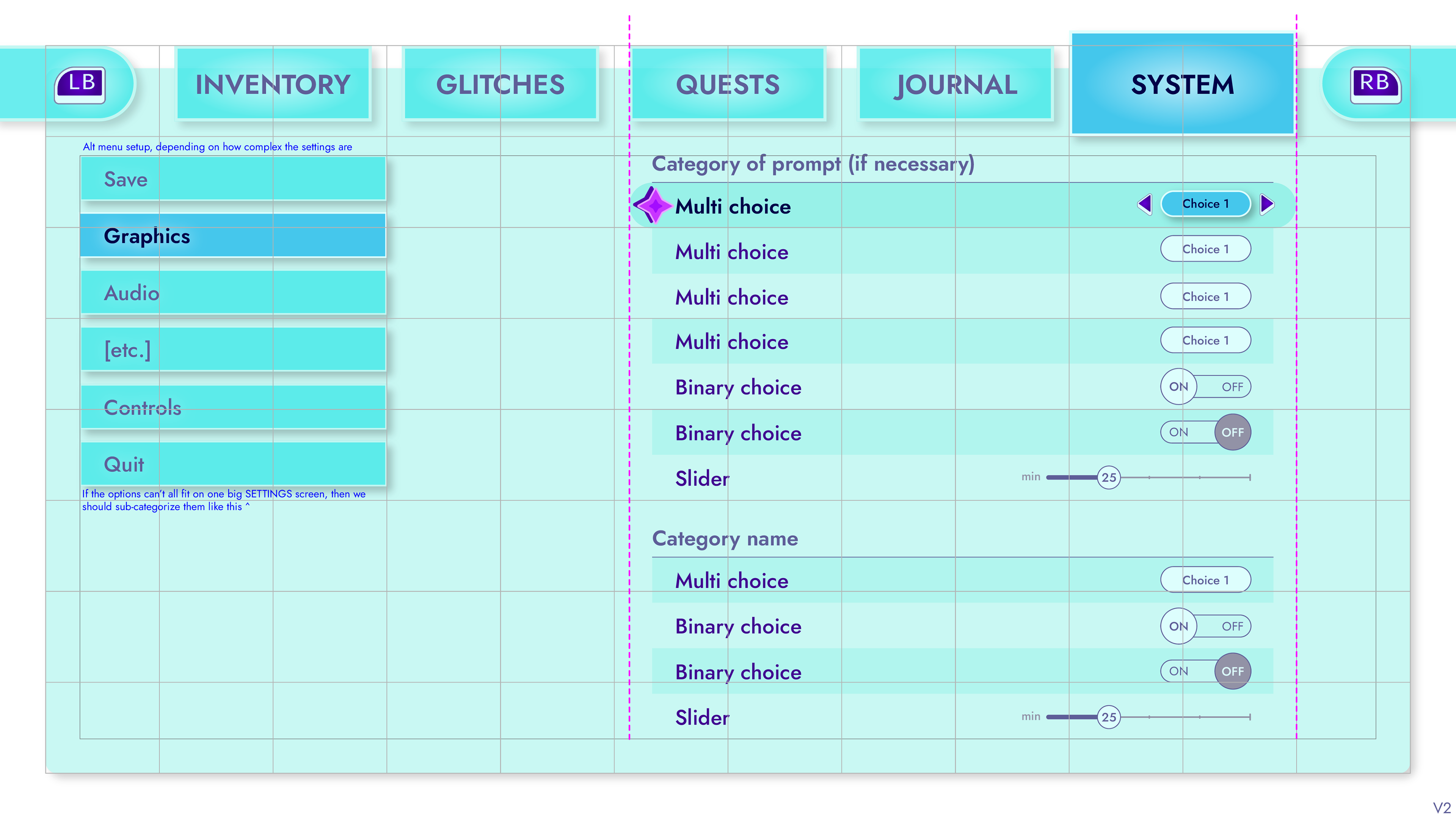
On this screen, nearly every element's specs are predefined by existing documentation.
Changelogs were provided with each spec guide update.
"Holy s***. You guys are wizards or something, it's impressive how you can coordinate so well over such tiny details."
– Lithamus (2D/3D artist), commenting on Katie and Kyoshi (programmer) working together in the server

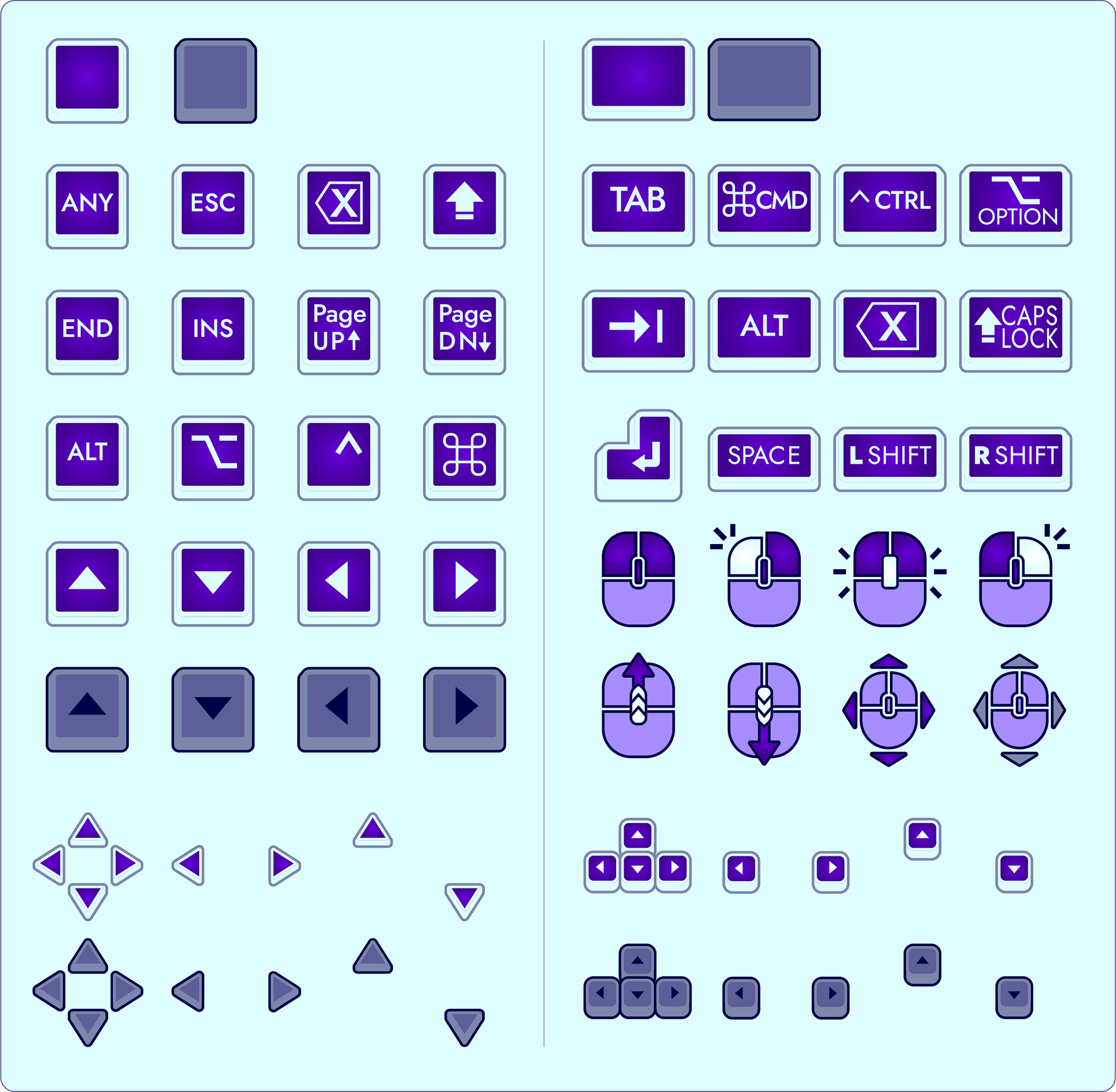
Full set of button prompt sprites.
High fidelity battle UI map
Starting with a clear wireframe map ensures that the system's information hierarchy is distributed evenly, and that all necessary functions are accounted for.
Battle UI wireframe sketch
The Summary screen is divided into 3 tabs—Party info, Review glitches, and Enemy info.
Review glitches and Enemy info were condensed onto one toggle-able panel to reduce the amount of information on the screen.
Example of Summary screen navigation
A pull-out key describing the otherwise unlabelled status icons keeps the Summary screen from becoming overly cluttered with information.
"This is a master class, [...] really intuitive to understand."
– Alex (programmer), referring to Katie's hi-fi screens
Want to see in-game footage?
You can watch the game trailer on our YouTube channel that we released in August 2024. You can also visit the Studio StegoRaptor website.
"This looks incredible! I love the Paper Mario aesthetic going on with the game so far. Keep at it guys!"
"The amount and variety of detail and care put into this game is amazingg!!"
"This looks great. Keep up the good work and don't rush it, I'll be waiting."
In addition to her role as the UI/UX designer, Katie is also an artist and the game's art director. Take a look at the rest of her work on this project below!
Contributors
Valler | Creative director
Kyoshi | Lead programmer
Alex | Programmer
BigBlueBackpack | Lead writer
Adonic | Writer, marketing specialist
RazberryRaccoon | Social media manager
Pieter van Vleuten | Lead musician
Terra Nocturnus | Musician
Sam LaGrego | Musician
Katie | 2D art director/artist, UI/UX
Lithamus | 2D and 3D artist
Aeryn Christie | 2D artist
Inkarat | 2D artist (former)
Sebnimations | 3D art director/artist
Ghan | 3D artist
Denis "Juba" Marcelino | 3D artist

